

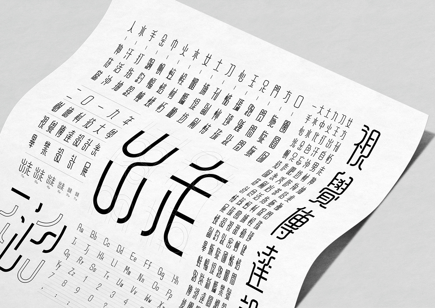
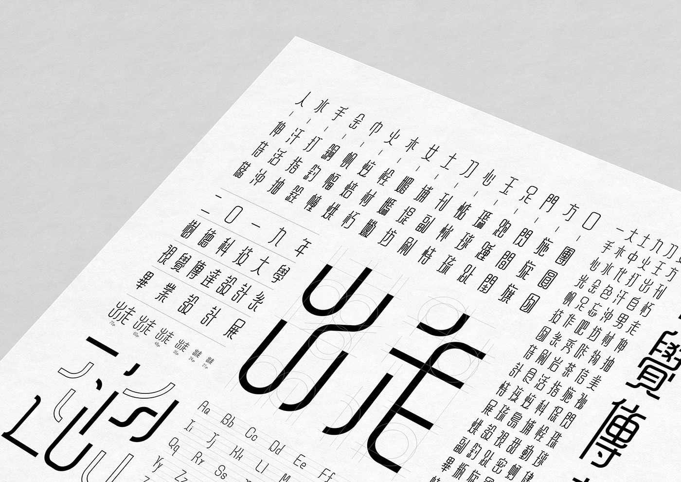
出走字體設計
字體設計以策展主題核心(出走)兩字做為發想,以延伸思維、拓展未來的概念來製作,想保留現代而俐落的線條但也有中國書法的流暢優雅,曲線與直線的組合柔軟但強烈的外觀,使字體具有清晰的結構維持其功能性,均勻的筆畫粗細營造中文字體的新鮮感無限延伸的結構,加強了字與字之間的連結有了閱讀、裝飾與靈活性,並滿足策展需求的現代感凸顯策展形象的核心,使用在本展覽形象與展覽周邊相關應用。
-
-DEPARTURE Fonts Design
The design of the font is based on the core of the exhibition (departure). It is made by extending the thinking and expanding the concept of the future.
It wants to preserve the modern flowing lines, but also the smoothness and elegance of Chinese calligraphy. The combination of curves and straight. The appearance has a clear structure and soft characteristic to maintain its functionality. The uniform stroke thickness creates an infinitely extended structure of Chinese fonts, which enhances the connection between words and words with reading, decoration, and flexibility.
The modernity that satisfies the curatorial needs highlights the core of the curatorial image and uses the image in the exhibition and related applications around the exhibition.


Designer | 黃士銘 Huang, Shih-Ming
Designer | 王昱超 Wang, Yu-Chao
Thank you !


